Client
Sodexo
Industry
Hospitality
Year
2018
Brief
The goal was to create a cohesive printed visual system that could educate, guide, and encourage diners to try ramen during a busy lunch service. Working together with Sodexo’s corporate marketing team, the project needed to make the offer feel accessible and attractive without slowing down the flow of service.

Challenge
Many diners were unfamiliar with ramen, and the context of a corporate canteen meant limited time, crowded lines, and a high level of visual noise. The materials therefore needed to increase participation, explain customization clearly, and communicate the concept within seconds.


Creative Concept
Rather than relying on a single hero asset, the experience was built as a coordinated family of printed materials, each with a clear role in the customer journey.
Key touchpoints included:
Roll-up banner: created awareness from a distance and signalled that something special was happening.
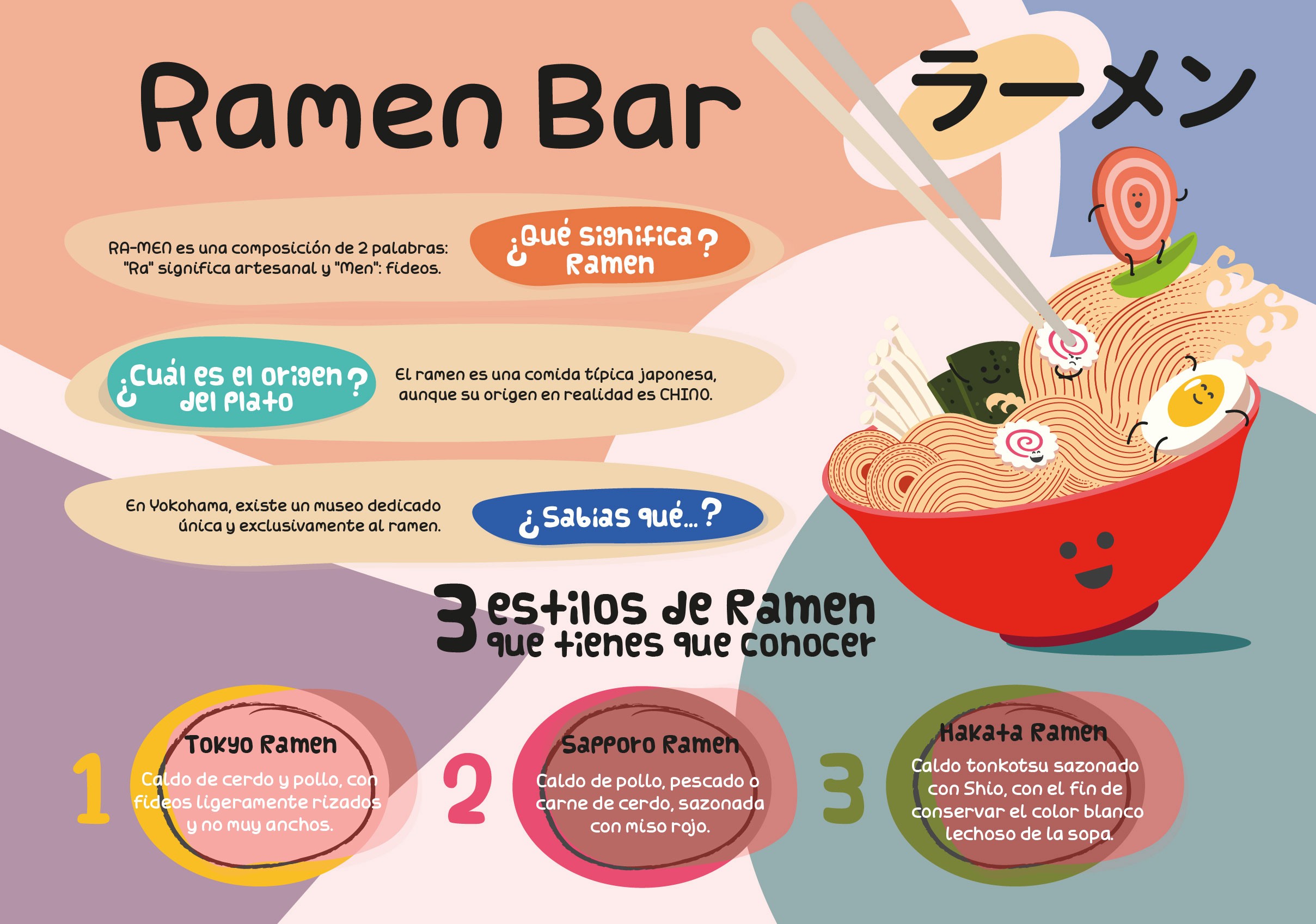
Tray placemats: used illustrations, friendly characters, and concise copy to explain what ramen is, where it comes from, and its main styles.
A4 stand-up panels: guided diners step by step through building a bowl, including base, noodles, toppings, and seaweed.
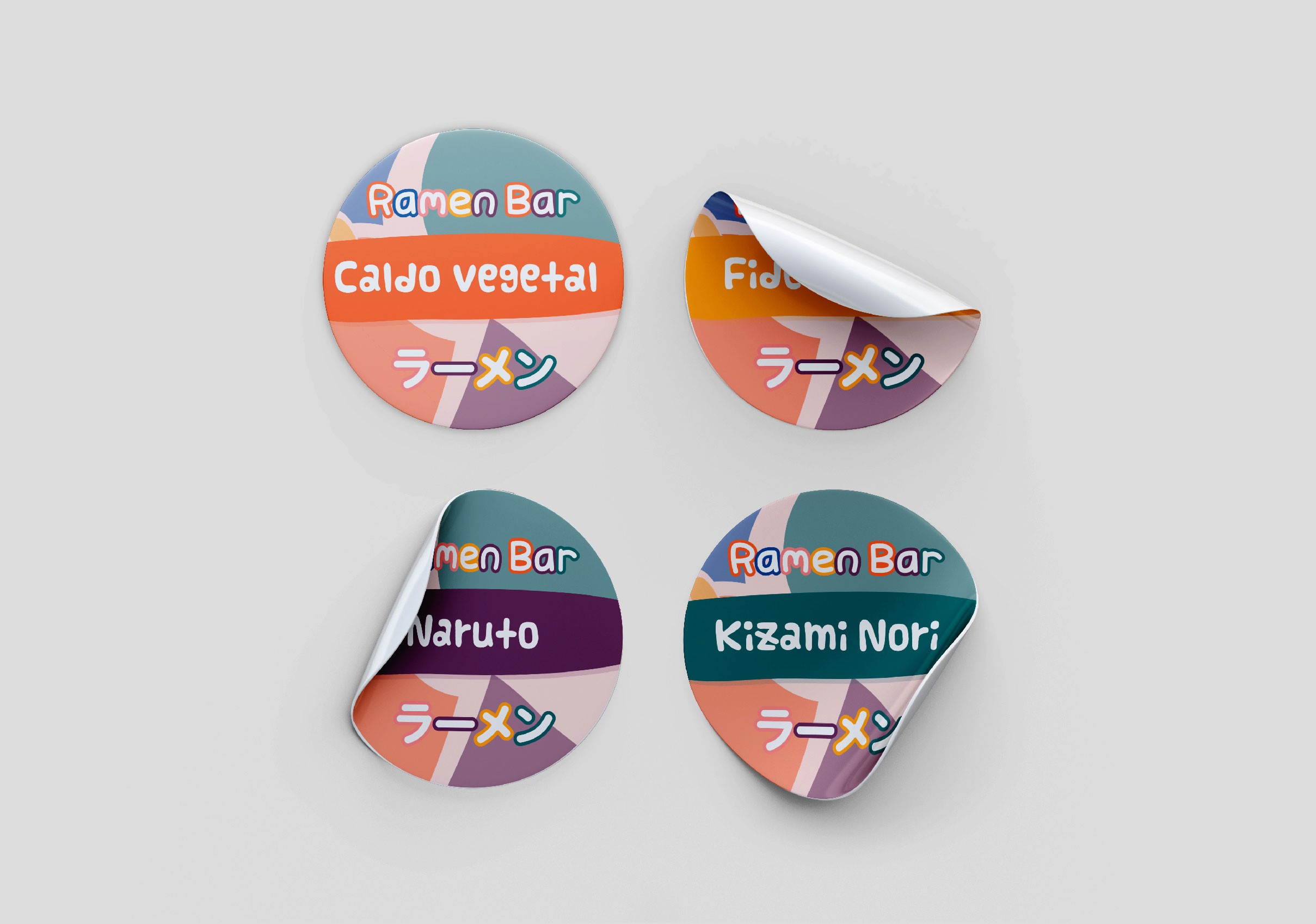
Ingredient stickers and labels: identified specific options and created fast visual wayfinding for both guests and staff.
The illustrations, colors, and character design kept the tone light and approachable, turning complex food information into simple visual cues rather than dense explanation.


Impact
The materials helped Sodexo test how appealing a customizable ramen offer could be compared with standard dishes, while keeping service smooth during a busy lunch period. The combination of clear messaging and friendly visuals reduced hesitation, encouraged experimentation, and demonstrated how information design can support more complex food experiences in everyday corporate settings.


Role
The work covered the full visual articulation of the Ramen Bar concept, including illustration style, color palette, typography, information hierarchy, and layout across all touchpoints. Content themes and key messages were aligned with Sodexo’s corporate marketing team to maintain brand consistency while making the concept easy to understand.